Bittersweet Capsule Wardrobe
Phwoar, to say that it’s been a while since I did a capsule wardrobe out of the pieces in my own collection would be a massive understatement! The last one was published in September 2021 and it’s all because doing these posts took up a lot of my time with all the collages. But now that I am using Whering, which removes backgrounds from pictures for me and is designed for putting together hypothetical outfits, I am hoping to get back on this wagon and finish going through the list of capsule wardrobe ideas that people have sent me way back when.
And I’m kicking off with one that is the least like what I wear: bittersweet, which I believe was suggested by @herroliness herself (and if not, then it would’ve been my other bittersweet enthusiast friend, @saltymadloli). Am I an expert on the subject? Far from it! I don’t wear bittersweet, I am very much at the entry level of pairing pastels with black, so please do not take any advice on bittersweet lolita from me. However, since the addition of the BtSSB Snow Dot skirt, I feel like my wardrobe could finally pull something at the very least bittersweet-adjacent, which is why I wanted to give this a go. And because it’s more fun to start off with a capsule that is a bit more challenging for me rather than going with something that I know I could easily do.
THE CAPSULE
 |
| Definitely click to enlarge! Since Whering is a mobile app, I can only do portrait orientation collages. |
Even way back when, when this capsule was still only an idea consisting of stock pictures, my first choice was to go with black x sax as a colour scheme. We all know the black x pink or black x lavender bittersweet looks - neither is something that my wardrobe could stretch to an entire capsule. But I do own a lot of sax pieces, plus it felt a little bit more exciting since it isn’t necessarily the most obvious choice of colourways for the theme.
As I was going through the pieces, I also noticed an accidental (?) secondary theme of polka dots. It probably wasn’t avoidable given what I own, though this did genuinely just happen without any conscious intervention on my part. When picking the items to use, I was more focused on the colours and fabrics first, so it wasn’t until everything was already together that I noticed all the polka dot or dotted items in attendance.
Lastly, having arbitrarily limited myself to 25 pieces in total, I decided to skip adding a bag in favour of an extra hair piece. Truth be told, I don’t have a bag that would fit the theme of this wardrobe… Or actually, I do have a black bag with polka dots. It isn’t lolita, but it could work - but since it’s the only one, every coord would just be assumed to use that, so it didn’t seem that interesting to include it anyway.
Now, the proof is in the pudding, so let’s see how well my choices of items are faring when put to the outfit test, shall we?
COORDS
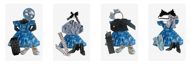 |
| Lady Sloth's Look at My Dreamy Sky casual OP |
The OP serves a couple of functions here. It’s a lazy option, but also one that can be dressed up. It sits in between the printed and the non-printed items, and can be coordinated as either. It can be a main piece or be used as a layer itself. Although it’s probably the most awkward of the shades of blue in this mix, at least having the black in between them helps to somewhat hide that.
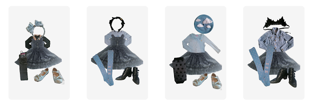 |
| Alice and the Pirates' Sugar Plum Fairy Princess JSK |
Every capsule needs a fancier piece and that’s what this JSK is. The flocked velvet with glitter on organza is incredibly classy. At the same time, as my previous attempts have shown, this dress is both pretty sweet and pretty easy to tone down since that flocked velvet print isn’t necessarily the most immediately visible, certainly not on photos. Despite what it may seem to be as a standalone piece, it bridges the gap between the sweet and the bitter pretty well within this capsule.
 |
| Bodyline's Sweet Macaron JSK |
Yes, I know that I’m not helping myself by going for a ‘sax’ that is objectively just sky blue. But since none of my saxes match anyway, I went with the more vibrant print, so that it can pull its weight against black as a base colour. And it does somehow manage to sit somewhere between the sax of the Lady Sloth OP and the sax of the Meta skirt. Plus, Bodyline doesn’t get enough appreciation for the pieces they did get right - let it have a moment to shine here.
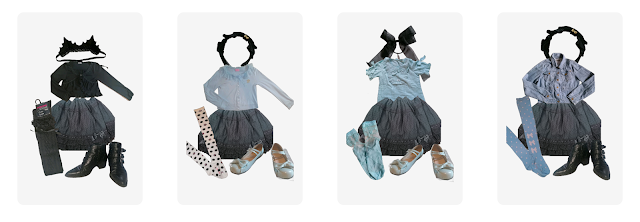 |
| Baby the Stars Shine Bright's Snow Dot skirt |
The skirt that started it all and made me feel like putting together a bittersweet capsule was possible for me. It became an instant favourite from the moment it arrived, the textured fabric and the lace are simply exquisite. To me, maybe through the sort of exposure that I’ve had with this theme, bittersweet is an inherently more casual look and skirts make the most sense. This is why, regardless of my opinions on the other coords so far, these four feel the most bittersweet.
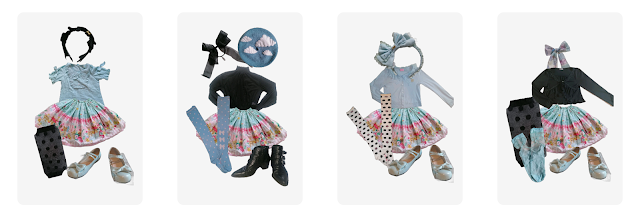 |
| Metamorphose temps de fille's Bubble Bath skirt |
At first I reached for my other BtSSB skirt before realising that this capsule could do with more prints. Bubble Bath is undeniably sweet and has proven itself in the past to work pretty neatly with black, which made it the best substitution. Even when styled in a more relaxed, casual way, the bold print still keeps it a bit more out-there than the solid coloured items. And for how bright and pastel it is, it does manage to hold up well to being paired with black.
FINAL WORDS
Let's start by addressing the elephant in the room and that is the collages themselves. Using Whering to create this capsule was an incredibly easy process, I could put each individual piece into a lookbook and then create away. Doing a set of four looks took no more than 20 minutes, including thinking and tinkering time, which should mean more capsule wardrobe posts in the future. At the same time, each image can only be layered under or over another, no further image editing is possible (besides resizing, that is). So I couldn't easily layer a cardigan over a blouse in a way that showed off the collar or that would hide the sleeves. Moreover, and that could be to do with my phone, but the app doesn't feel like it has enough space in the outfit creating interface, making the collages feel crammed in. The app is very obviously designed for mainstream Western fashions and it shows in little bits like this, even though I really enjoy using it for outfit planning. It may take me a while to figure out a more aesthetically pleasing way of arranging these collages, so just bear with me for now, please.
As far as bittersweet capsule wardrobes go, there is a lot of room for improvement here. But as far as what I could manage with that theme, this isn’t a bad attempt at all. Not every coord pictured here is strictly bittersweet, however, I wanted to show that this capsule wasn’t a one-trick pony and has more to offer. Some of these coords are blatant reuses of outfits I’ve done in the past, while others might end up in my bank for potential wear later. Sure, this isn’t my first choice of colour combinations or themes, but it’s still clothes that I own, so having the options is great. Despite using only 25 items in total and despite definitely relying on base sets that I knew worked, I didn't feel like I was running out of options to try.
Now, I’m not promising to return to making these capsule wardrobe posts on any sort of regular or even semi-regular basis. They will happen as and when I feel inspired to do them. At the same time, I’m not denying that thanks to Whering these have stopped becoming a chore that I avoided, so it shouldn’t be another 16 months before a new one of these happens again. As always, if there are themes that you’d like to see me attempt using the clothes that I currently own, let me know in whatever way feels the most comfortable for you. Whether in a comment here, via an Instagram DM, through email, YouTube, Patreon - I am bound to pick this up one way or another and would love to add to selection that is still waiting its turn since I first gathered a bunch of ideas.





No comments: