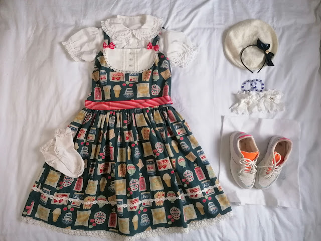
Look 1: ワッフル (Waffle)
 |
| | offbrand cardigan, hair clips, and bow ring | Roji Roji socks | Sosic Shop shoes | Imogen’s Imagination beret | handmade choker | Risu Rose ring | |
As you’ll quickly guess, each of these coords was inspired by a food item that may or may not be featured on the print itself. Waffles aren’t, unless we count the ice cream cones. I like how the yellow items immediately brought out the pretty muted shade of blue to life. There’s a reason why primary colours look good together and this coord is proving that pretty well. Of course, were it to be worn there’d be a blouse of some sorts too, I was being lazy when putting the flatlays together.
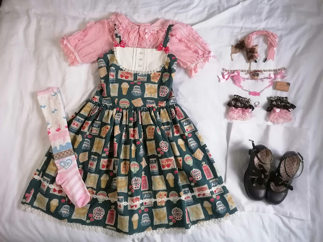
Look 2: ナポリタンアイス (Neapolitan Ice Cream)
Oof, writing out the items in sweet coords always takes up so much space, even when there isn’t actually that much. In the spirit of tricolour, I swapped out the colours for those of a Neapolitan ice cream: strawberry, vanilla, and chocolate. The blue of the dress serves here like the canvas to convey the ice cream and to add those white accents whilst everything else is focusing on the other two colours, which aren’t so prominent (or even present) within the print.
Look 3: 牛乳 (Milk)
 |
| | Metamorphose blouse | offbrand socks, shoes, and beret | Innocent Word Art Nouveau headbow | handmade bracelets | Cutie Creator wrist cuffs | |
The casual coord for this post inspired by those milk cartons on the print. And to be honest, I might even swap the beret and headbow out for just some hair clips if I do ever wear this out. Sure, it bothers me a bit that the sneakers have all those colours except blue on them, but the reality is that most of them aren’t really seen when worn, so it works as just a simple white base. Though now that I look at this, I should’ve removed the belt and replaced it with the white bow belt from Banned Retro that I have. Oh well, that’s something for the future.
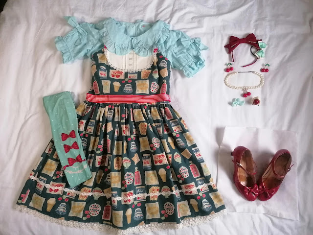
Look 4: チェリーミント (Cherry Mint)
I’m pretty annoyed with myself on this one too because I had literally written down to use the AP Cherry Stamp socks and then somehow not seen that, as well as completely forgotten that I even own them, to the point where I didn’t even see them in my drawer. This version gets the point across, but I think the overall look would’ve been nicer with them. Red and mint is a great colour combination, even if cherry and mint isn’t a flavour combination that I’d personally go for.
Konbini Market lends itself so well to all sorts of looks thanks to all the various colours that are already within the print. Though it seems that it also leans more towards more casual styling. Which isn’t a bad thing! However, seeing as I haven’t done my usual thing of trying to create something more OTT for this post, I may simply have to find an occasion to create something more OTT at some point. Maybe it’s time to make a new giant straw… That’s future Paulina’s problem though.


No comments:
Post a Comment