“A certain accessory” is a very open-ended kind of prompt. Yet somehow, whilst I’m sure I must’ve thought on that and debated my options at least a little, I don’t remember that. I guess that as soon as I decided to focus on my less used accessories, as opposed to favourites, a clear choice emerged and I focused on that.
| Innocent World Revival Sweet Teddybear JSK | Primark blouse | apron from BtSSB’s Polonaise Brillante JSK | Angelic Pretty Diner Doll OTKs | Sosic Shop heels | Beholder Fashions Apple Pie headdress | After Midnight Whipped Cream headdress | Angelic Pretty Fancy Crepe necklace | Claire’s Japan earrings | Lady Sloth My Coffee Time brooches | Angelic Pretty Cute Ribbon wrist cuffs | Twinkle Kitty Boutique white bow ring | Beckie’s Kawaii Charms gingerbread lady ring | Love a Lolita cupcake ring |
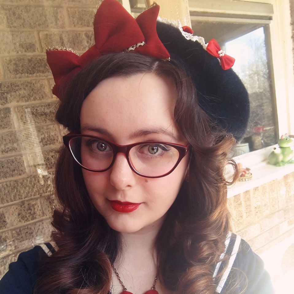
Rather than picking one particular accessory, I opted for one type of accessories, of which I fortunately only have two examples of: the felt headdresses. One made by Beholder Fashion (formerly Sheena’s Bella Bows) and one custom-made for me by After Midnight. These don’t get a whole lotta love because they are by their very nature quite OTT and not the easiest things to just throw into a coord. I really couldn’t decide which one of these to go for, so since one was already going to turn the coord pretty OTT, why not use both and really go to town? Of the dresses that I haven’t used in this challenge yet, Revival Sweet Teaddybear was the best match because despite it being a more toned down kind of sweet, it’s still very sweet, food-themed and matched the colours of both headdresses well.
Looking good enough to eat!
Perfectly golden brown, no soggy bottoms (sorry, couldn't resist that one).
Eat before it melts, the cherry already slid off the top.
Given the prompt it’d be criminal to start with anything else but the headdresses. I love how they are tiptoeing the line between realistic and cartoonish - it’s the right vibe for sweet lolita fashion. Whilst the apple pie is all golden and shiny, just looking at it warms you up from inside, the whipped cream is soft and fluffy, makes you want to eat it quick before it melts. I tried stacking one on top of the other, for the ultimate whipped cream-topped apple pie, but unfortunately the sizes are just a little bit off and it threw the proportions off by too much. So instead they are being used side by side, which allows us to appreciate them both separately, for their own merits, as well as together as a pair. Some people prefer their whipped cream on the side and that’s ok too.
Turns out I forgot to photograph the sleeves - but I did remember the frills. This is the most hunted Primark blouse in the history of Primark blouses.
Now back to my usual order, I knew that I wanted to use a blouse that had slightly puffier sleeves. My most puffy-sleeved blouses are firmly on the classic side instead of cut, but luckily I have this Primark one. It’s not the most dramatic in terms of sleeve volume, and a Peter Pan collar might’ve been better for amping the sweet vibes of the coordinate, but it was enough for what I needed. Plus I realised that the ruffles worked really nicely with the JSK straps, peeking from under them just enough to remind of ruffled aprons that maid cafe uniforms often have. It’s not something that I planned on, it simply worked out well, and it made me want to acquire a maid-style headdress. Although in this coordinate it would’ve been lost behind the felt headpieces (unless it was really big), if I found a way to incorporate it, it would make for a super cute look, don’t you think?
At House of Cupcake Kamisama we don't despair colours that don't match - we force them to work anyway!
These are honestly one of my favourite shoes and considering that they get worn quite a lot, they are really holding up well.
For someone with as many socks as I have, I should not be finding out that there are still types that I need. However, I don’t, in fact, have any white x sax sweet-themed socks in my collection - I have either fully sax sweet-themed ones (all in different shades of sax, of course) and an ivory x sax classic themed pair. So I went with the next best thing, which were the Diner Doll socks. Although they are technically white x mint, the most prominent mint parts weren’t visible in the outfit when worn, whilst the rest of the colours tied in enough with accessories to make this an acceptable choice. Of course, the sax of the shoes doesn’t match either, but these were a better option than my mint Bodyline tea parties. If I ever find a pair of shoes in the same dusty shade of baby blue as this dress, it will definitely be offbrand, I don’t think any lolita brand produces that colour in shoes. Until then I will continue using these ones with this dress whenever I can.
I guess the size kind of makes up for fewer numbers...
As per usual, OTT coords don’t always look like such when you lay them out flat. What is it with that? Is it simply because the accessories are separate from the clothes and where they’d actually be placed? Is it because the backdrop behind the accessories is now plain or because the sizes feel different worn vs laid out flat? This is the great mystery of our times.
And the most hunted necklace in my collection. Come to think of it, there are three highly sought after elements in this coord. And three is a pattern!
Since I’ve already talked about the headpieces, let’s move down. The necklace was a pretty obvious choice. Not only because it’s my only food-themed blue-based sweet necklace (although that is a very important reason). The necklace ties in all the other bits of mint that crept into this coord because of my not having any better alternatives that were closer in colour to the dress. And I also spent way too long obsessing over this dumb piece of plastic, chasing it from one re-release to another until I finally got my hands on it, so I will wear the heck out of this silly thing out of pure spite, if nothing else. The earrings, on the other hand, are quite small, though I feel like in OTT coordinates every accessory matters, however big or small. All of my blue earrings were either the wrong theme or even smaller - thankfully I had these ivory ones which are just right. They may not be big, but the little bit of bling on them ensures that they’re visible and catch the light.
Oops, I put the middle brooch upside down! It's ok though, it was the right way up when worn. Let's admire the most adorable mouse instead.
It’s mostly coincidence that all brooches used in this coord are from Lady Sloth’s My Coffee Time series. Again, turns out that in my vast collection of brooches, in the blue drawer that I can’t even close properly, I don’t have that many sax and food-themed ones. These ones are technically in the mint colourway, so at least they keep tying those mints together, and thanks to the beige/ivory/brown designs it’s not that noticeable either. I do not need to enable myself to get more stuff, let’s move on.
Using items I've had since maybe 2015/2016 and hardly used is pretty satisfying to my inner hoarder.
Luckily, at least my hands had enough actual sax-coloured and sweet-themed items. The blue rings are from really early on in my lolita wardrobe building days and thinking about that now is kind of making me nostalgic. This is one reason why I can’t envision myself not hoarding things - being able to prove that my past self’s purchases were not unjustified and that they are useful to me now. Whilst the wrist cuffs add that extra touch of sweet lolita to the coordinate, they were also really necessary both for colour balance and dressing the blouse up. However nice, textured and ruffled it may be, it’s still slightly too plain for lolita, particularly the OTT variety, and they help mask that a little bit.
More cute belts in lolita, please.
The apron hits at just the right length too, so that it doesn't obscure the print.
This belt is one of my favourite features of this dress. Generally, this cut of JSKs is one of my favourites, it’s so comfortable and flattering for me, that I am genuinely tempted to get other dresses I see second hand in that cut. Which isn’t the most sensible idea and I know that. In here the belt also helps blend the apron really nicely. On the Polonaise Brillante it’s attached with buttons, which obviously this dress doesn’t have. For this outfit I simply pinned it to the dress (insert commentary about historical pinafores here), then used the belt to hide the pins. An opaque apron probably would’ve matched the overall sweet outfit theme better, however, this is the only one I have. Besides, the lace works really well with the dress: both pieces are sweet, but with a more classic finish to them, and they’re also a similar, if not the same shade of ivory (where ivory features on the dress), so they may as well have been made for each other.
I'm actually not sure what is this cake supposed to be. A birthday one? An Easter one? A Christmas one (with that gingerbread house)? We'll never know.
The problem with food-themedd sweet prints is that they make you want to eat.
And speaking of the dress - it’s still just as much of a dream dress as when I first got it after years of searching. It’s been a while since I’ve seen Innocent World have a go at sweet lolita in this kind of way, and although the memory of their 2016-2017 years makes me happy that they’re back to doing typical classic which they excel at, no-one else does muted sweet like they did. This may be a simple border print in comparison to what Angelic Pretty was releasing at that time, but there are still details I completely did not notice until now - like that bunny on top of the cake!
The most adorable bear, I love him so much.
Seriously though, that green is everywhere and yet I missed it for so many years.
The bear may be more central, since he’s literally at the very front of the dress, yet even he has elements I didn’t notice previously. How vibrant is that green? There are pops of it throughout the border print than I was blind to until taking these photos. And now that I have noticed them, I want to coordinate this dress with green. Too long I’ve been sticking to reds, whites and pinks with this piece, it’s time to branch out!
Very clever layering of the print to add a bit more depth and detail to the overall design.
I also love how the border print is wrapped in that red ribbon, just adorable.
What truly makes this Innocent World’s sweet design stand out to me is how cleverly they bypass the lack of details that we’re used to in lolita dresses. This cut features no lace at all, nowhere. In fact, take away the collar overlay and the entire dress cut is really simple, barely qualifies as lolita by today’s standards. But by adding that scalloped stripe collar overlay and then printing a scalloped doily design at the bottom with the same stripes peeking from under that create an illusion of structural details. I’m sure I said that before, but I’ll say it again: those stripes make me think of ice cream parlours with the striped canopies. This is the sort of sweet retro aesthetic that I love and will never tire of, it brings a smile to my face, and by evoking those warm and fuzzy feelings in me - so does this dress.
The Brightlele wig finally got a more thorough brush and I'm relieved to say that the curls are still there - just a bit bushier. If I ever need a Hermione Granger hair, this right here is it.
Wearing two such bold hair accessories requires framing them the right way. The easiest way to balance them out was to get some volume in my hair and I went down the lazy route of using my fluffiest wig. Honestly, it is a bit of a nightmare to wear because it just will not stay in place and keeps moving to cover my neck. It’s a price I’m willing to pay though, as it makes balancing out big headpieces a piece of cake. This time I even actually did stuff with it - and by stuff I mean pinned two sections slightly higher to bring that volume up, just behind the accessories, and mimic twin tails. Having all the focus on my hair and the accessories allowed for a simpler makeup, though I did stick on a pair of false lashes for balance. I also had a pop of colour by adding blue as my inner corner highlight, which sadly got lost in the photos.
As I already mentioned, this dress usually gets worn with ivory, pink or red. Although I was able to get a good range of coords with those colours so far, I do think it’s prime time to branch out. I still barely touched on chocolate/biscuit themed and coloured coords, which this dress is more than capable of carrying, and there’s the matter of that newly discovered green left to address.
Did I buy that mixing bowl because I was planning on using it in this video? This is entirely possible. Even though my kitchen uses a lot of blue, I knew it’d match and I needed a proper mixing bowl anyway, I can’t not acknowledge that this challenge and the lookbook video that I had in mind encouraged me to get the bowl. Let’s appreciate the bowl, even though it’s only in for a few seconds, the bowl may as well have shaped the direction of this outfit as we now know it.
AYWi30C #20 - Around a Certain Accessory
Reviewed by Cupcake Kamisama
on
10:00:00
Rating: 5
Cupcake Kamisama – she/her. A 34-year-old Capricorn, Polish-born, UK-based and in love with Japanese fashion (predominantly lolita). When I don’t blog, I work in the education sector, write fiction, and translate video game content on the side.


No comments: