Violet Fane/Sumire Ginza Kissaten skirt review
When something is right for you, the cupid’s arrow strikes instantly. That was the case with the Ginza Kissaten series from Violet Fane’s Sumire line, which I have followed from the first preview on Instagram up until the release dropped. And now that it’s here, let’s look at it a bit more closely!
Timeline
For a bit of clarity, here is the timeline of the whole order process:
- First tease of the series was dropped on October 8th 2021
- The series released for preorder on November 8th 2021
- Order placed on November 8th 2021
- Email with details of the production process and an estimated shipment date was sent on November 24th 2021 (then the ETA was February 2022)
- Email notification of Covid-related production delay was sent on February 28th 2022
- Shipment notification sent on April 29th 2022 (my order was shipped with DHL Express)
- Arrival on May 2nd 2022
Considering how Covid continues to affect us, a 2 month delay to the original timeline is not so bad, especially if it did mean that safe working conditions were ensured throughout the production process. And I am particularly impressed with the arrival date as that was a Bank Holiday for me in the UK, so I fully expected DHL to deliver only on working days only. Having it even that one day sooner is a nice bonus.
Ginza Kissaten skirt
Upon reviewing the entire offering within the series, I have opted to get the skirt in ivory (which VF called the Cream Soda colourway). None of the accessories released with it appealed to me and whilst given the much more yellow-based colour palette of the series a JSK may have made things slightly easier to coordinate with what I have, neither the details of the bodice nor the shades of the other colourways appealed to me personally. Also, based on my experience with Violet Fane’s skirts, as well as other people’s experience with their JSKs, a skirt seemed a safe bet that I knew I could make work.
For the price of €90 plus postage I received the skirt and a small assortment of freebies: a ‘thank you’ card, a sticker and a cork coaster with the Sumire Cafe logo. The sticker I expected, it’s a pretty standard freebie to receive. The coaster, on the other hand, was very outside the box and it brightened my day a lot. Even though it’s not the thickest one, very clearly made to be a free gift with this release, it is way more practical than a postcard would be, but still nice and flat enough that if someone doesn’t want to use it, they can display it on a wall alongside other postcards or something. It also adds that perfect vintage charm that I love about this style of Violet Fane’s (and now Sumire’s) releases.
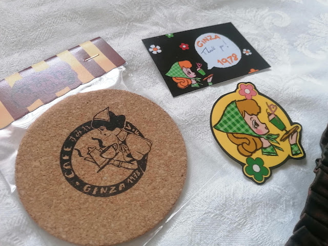 |
| The 1970s never appealed to me aesthetically, but this series is rapidly changing that. |
But as nice as the freebies are, we’re here for the skirt. Despite some vague recollections of the release being announced as a cotton one, the fabric still took me by surprise. It is a cotton blend rather than pure cotton (98% cotton and 2% elastane), nonetheless it is a thick and sturdy material. The lining is also a breathable fabric (though plain as opposed to Violet Fane’s usual patterned lining) and the lace trim along the hem is a simple cotton lace too. This gives the skirt some more substantial weight overall, of the three Violet Fane skirts that I own this one is easily the heaviest, as well as allows for the fabric to drape nicely with a bit of volume of its own. With a petticoat it makes for a very pleasing cupcake shape and that tiny bit of elastane in the blent seems to limit creasing and therefore the need for ironing as after a day of sitting on it the back wasn’t too terribly wrinkly.
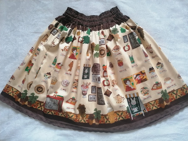 |
| Funnily enough, the colour is actually way more accurate on the filtered thumbnail above than on this picture taken in daylight. |
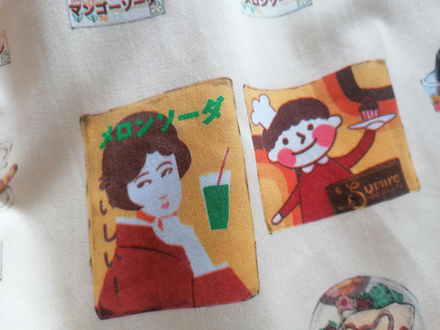
Like with all releases like this, however, we are here mostly for the print. And that is, in Violet Fane’s usual style of cuter releases, very charming and full of warmth in that hand drawn style. The ivory colourway of the print really lends it those extra 1970s vibes by making the oranges and browns all the more prominent. The stained glass along the bottom of the print feels so nostalgic of old cafes and the print absolutely nailed all of the crockery. It looks exactly like the ones I remember my Grandma owning which was definitely from the 1970s!
 |
| The urge to replace all my crockery with this because of nostalgia is way too strong. |
 |
| The lace is extremely simple, though works well with the print, looking kind of like a vintage curtain in the aforementioned cafe window without being that horrible 1970s net lace. |
One of my favourite things, other than every menu item looking so stupidly cute in that quintessential kawaii way that Japan excels at, is how seasonally versatile it ended up being. Of course food prints, which this basically is, aren’t restricted to seasons. Yet the whole design balances elements that make it appropriate for various seasons: cotton’s breathability for warm weather, warm palette of earth tones for autumn, a sense of nostalgia that my mind associates with winter, those pops of green to work in spring…
 |
| This particular drink had me at the look and made me stay once I read that it's mango soda. I'll have ten! |
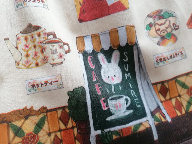 |
| I have definitely walked past signs like this during my time in Japan. |
Like every other Violet Fane skirt that I own, this one does not come with pockets. The full shirring is as generous as it was on the Otome Nostalgia release, if not more so by virtue of using slightly thinner elastic. Though with the additional accent of a band of dark brown as well as the thicker fabric, it does feel a bit more chunky overall. And whilst it's the same length as Otome Nostalgia, since this one has actual lace at the hem rather than a small trim, it ends up hitting me very ever so slightly below the knee.
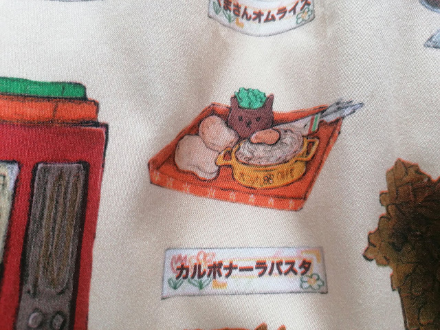 |
| That is some interesting looking carbonara. But what it may lack in authenticity it certainly makes up in cosy feels, this looks so warming and homely that I just want to tuck in. |
As always, I have had no problems with Violet Fane’s quality of work: the print is crisp and the construction, however simple, executed well. I am looking forward to seeing what I can do with this colour scheme in terms of putting together coordinates. Part of me anticipates needing to expand my collection of browns a little bit more to comfortably incorporate this skirt into my style. Still, right now the challenge excites me and I would really love to do something fun and quirky with this print that leans into my current niche of retro-styled outfits. And in the meantime, knowing my weakness for what has become the Sumire line of Violet Fane’s offering, I better make sure that I have some savings for whatever may come next.
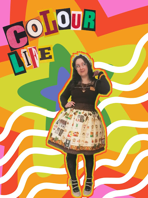 |
| Quick Meitu edit of the first coord with this skirt. Not quite as 1970s as I would've wanted, but a strong start nonetheless. |




This skirt is gorgeous and suits you so well!
ReplyDeleteThank you! It's inspiring me to get some more browns into my wardrobe.
Delete