Oh, this prompt has been giving me a headache for such a long time! Too many options can be as overwhelming as a lack of options can be limiting. And I guess a coordinate that follows the rules didn’t seem like a challenge to me. I thrive with prompts that force me outside the box and enjoy looks that are different and done well. Yes, your textbook lolita coords are valid, but in their most basic form they’re just not my jam.
For the longest time I was stuck between two options. Option 1: doing said textbook lolita, preferably with something that’s a full set (of which, to my own surprise, I have four, depending on how strictly we define a full set). Downside of this was that I really don’t know what I would say about an outfit like that. Option 2: go against that and prove that you can still follow the rules and have an exciting coordinate. But that didn’t help me narrow down my choices either, not without an additional theme or something. So what do we do when faced with a tough choice like this?
| Baroque x Sakizo Repose of Queen Teatime Dress with overskirt, headbow and tights | Angelic Pretty Romantic Bright blouse and brooch at the waist | Irregular Choice Earl Grey shoes | Claire's Accessories flower clips | offbrand earrings, necklace and ring | Star Glazed Delights ring | Angelic Pretty Logo Ribbon Charm wrist cuffs | Basic Love bloomers |
We do both! This outfit was born out of an attempt to spice up a complete set to be a bit more exciting. After all, isn’t the devil in the detail? Moreover, I wanted to have a go at following all the rules, even the ones that aren’t really rules or that we have softened up on over the years as a community. So every element that became synonymous with the look of lolita fashion and ingrained in us as “the rules”, this outfit ticks off. To show this off better, I will talk about this coordinate from top to bottom instead of my usual route of going from the biggest to smallest pieces before talking about the dress.
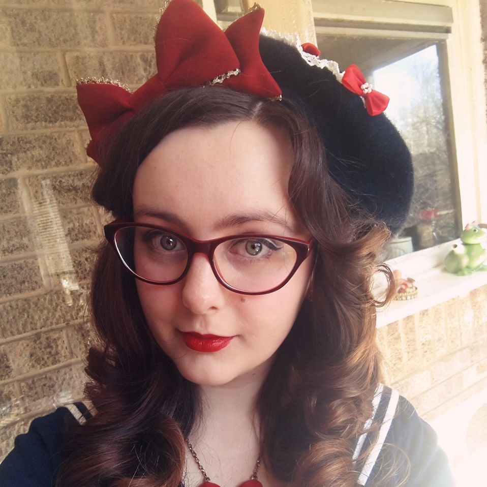
I am glad that this headbow is actually a 2-way clip because otherwise I probably wouldn't have used it at all until now.
It’s not lolita if you’re not wearing any hair accessories, preferably a bow. This headbow is part of the Repose of Queen set and what I love about it is that despite being on a headband, it’s actually a 2-way clip. That’s how it was made by Baroque and an element of versatility from a small accessory that I truly enjoy. Although to date I’ve only worn this hair accessory once and not in its headband form. It’s of the more head-eating variety, even though it really doesn’t seem like it at a glance, which means having to balance it out with something else. As I’ve added colour to the coordinate, I’m incorporating a bit more of it on the head through some additional flower clips. By which I mean pretty much every pink flower clip I own.
In the gold vs silver battle we forget how elegant bronze is. Very underrated and I'd love to add more of it to my own collection.
A coordinate needs accessories, that’s a given. Particularly in cases like this where the cut of the OP and the blouse leave the neck shamelessly exposed. That’s not modest and lolita is supposed to be modest! I picked this choker I got from AliExpress for Dream Masquerade Carnival (which I don’t think I ended up using for that after all) because it combines both the ivory and the pink from the overall coord. Yes, the mask charm is a little random against the roses and the beds, but at least the bronze colour matches the tassels. As I ended up having my hair up, I also added the earrings to fill up that empty space. They’re not quite what I would’ve like, but it turns out that there are still earring styles that I do not own. So since these are both bronze and roses, they matched the most for now.
Over my time in lolita fashion I realised that I very much prefer open necklines like scoop, square, and sweetheart. They are more flattering on me than Peter Pan collars and more comforable than high neck.
We love a sleeve that is unnecessarily extra in this house.
It may not translate as well on a flatlay, but the two sleeves did in fact work well together. And just look at both of those lace trims!
Now here’s a thing that’s not done as often anymore as it used to: wearing a blouse under an OP. The whole point of a one piece is that you don’t need a blouse because it already covers your shoulders (another important rule in this fashion), so this may seem counterproductive. However, OPs are also notorious for not being versatile enough because you can’t change their look with blouses. That is unless they’re short sleeved ones, then you may be able to, like I’ve done here. I promise that it looks ok when worn, it’s simply a nightmare to make it look even barely presentable on a flatlay. I love how the princess sleeves match the opulent print and Rococo vibes of the dress, whilst the colour brings out the pink hues from the flowers in the print. If I could have one minor complaint, it’d be that I wish the sleeves were long enough to reach my wrists.
Even though I prefer bracelets, I do love wrist cuffs. The upside of having an OTT coordinate is that you can wear both at once.
But as the sleeves hit my elbow, I ensured to dress my wrists up properly. My own style leans much more towards bracelets than wrist cuffs, even though I absolutely adore wrist cuffs, they are such a quintessential lolita accessory. I know that covering your wrists is considered one of the rules, but was it specifically wrist cuffs at some point? I’m not actually sure, it may have been. Next to the blouse on the flatlay these ones look obviously different in shade, but they work much better when worn. And as the coordinate is quite OTT, I added the bracelets too, for good measure.
One ring on each hand for balance.
Having absolutely no rings would just feel off when everything else is so elaborate. I am actually determined to add some rose-shaped rings because I feel like my wardrobe could do with some of those. For now there is one for elegance and one for colour. It may be a bit ironic to wear a “Brand Whore” ring when the only pieces of brand in this coordinate are the blouse and wrist cuffs, so let’s say that it’s a cheeky wink to say that you can follow all of the rules and not use brand at all. Especially as both the blouse and wrist cuffs could easily be removed without the coordinate losing anything in cohesion OR in terms of how well it adheres to the rules.
Nothing particular to say about these other than that they serve me well to this day.
Before we proceed, let’s have a quick stop around the unmentionables. Bloomers. We all know that “the rules” say you have to have bloomers. We also all know that this is personal choice and that since they are underwear, people won’t demand you to prove you’re wearing any. But let it be known that this outfit did include a pair of lolita bloomers, the very first one I ever purchased (because they were white and cotton, which matched the outfit and the weather). Sadly that indie brand seems to have ceased, though you can still read my original review if you fancy. For anyone on the lookout for fantastic bloomers, check out Sugar Trampoline instead. Nothing more to say about those, so let’s move on.
Adding that little pop of colour to the centre of my torso balances the pinks out really nicely.
It is a truly beautiful overskirt. It's a shame that I don't wear it as often, but the dress is already Very Extra without it.
Going further down the bodice, I decided to add the detachable clip from the blouse onto the dress waist. It helps to balance out the colours a little bit better, making sure that the pink is thoroughly incorporated into the coordinate. As for the overskirt, this is the first time I am actually wearing it, with this dress or any other one for that matter. Every other time I’ve worn this OP, the overskirt was either too much or it didn’t match the look I was going for. But since I am making a point here about following the rules by using the full set, the overdress stays since it’s very much a part of the set.
Printed tights are a double edged sword. They can be too much with some coords and not enough with others, particularly if they lose colour saturation or sharpness due to stretch.
And speaking of sets, it’s not complete without matching legwear (yes, that is a dig at brands not releasing more cute matching legwear these days). These tights weren’t something that I specifically ordered. At the time I could only buy the dress and one other accessory and I picked the headbow. However, Baroque had a special offer whereby spending over a certain amount on the preorder meant you got the tights for free. They stated that they can’t guarantee you’ll get matching ones - but I’m sure they made effort to try because that’s exactly what I got. I actually adore how the print was adapted for the tights. You still have a bit of interest on your legs, but the print is not too much so it doesn’t compete with the dress.
Aesthetic hobbling enshrined in the form of a shoe, oil on canvas, circa 1768.
Ah, Earl Grey heels, my sweet nemesis, we meet again… Seeing as my legwear was white, I really needed something at least pink-ish for shoes. I realised recently how much my wardrobe needs some classic heels in pink, since my only pink shoes are very much the sweet variety (or not quite fancy enough for an elaborate coord like this one). These shoes have light pink bows on them, as well as a bit of pink-ish sheen on the main fabric, so they help tie that colour balance together quite well. I will no doubt put myself through the suffering that is wearing them many times still to come because these shoes just elevate your coordinate into something stunningly elegant. But I guarantee you that they are taken off as soon as possible and every chance that it is practical to do so! Hobbling around because of pain in your feet is not kawaii.
Just look at the intricacy and depth of detail! You can see each individual tassel and each carved curve.
With a glimpse of the overskirt to show how well it goes with the print.
And now I can return to the star of the show that is this wonderful dress! The reason I decided to pick this one with its matching bits over other ones was two-fold. Firstly, it’s long enough to comfortably reach my knees, even when stuffed with petticoats, as was the case here. As a community we have softened up on the “no knees on show” rule, though clearly not enough since you still see people occasionally asking or excusing themselves when they can’t achieve that. It’s 2020, people, those rules are old and not applicable anymore, you can let go as long as your dress is very clearly lolita and you simply happen to be a much leggier being than the dress can handle.
This lace may be super tiny, but it blends with that print exceptionally well.
Bedroom goals since 2017, honestly.
On the other hand, as I already mentioned, OPs come with the caveat of not being as versatile as JSKs. That is their whole point, that you just throw one on and that pretty much becomes your coordinate with a few bits, but it is a factor that stops many people from getting more than a few. And whilst I agree, because this particular OP is short sleeved, I feel like I have been doing pretty well with wearing it differently each time that I do put it on. The changes are not major, but significant enough, which you can hopefully see on the collage of past outfits with it.
The dress is only ivory x gold at a glance. The more you look, the more wonderful rich colours you find.
Those dumb feathers get me every time. They're so unnecessarily extra, so voluminous and flowy. Why aren't we decorating beds with feathers? This is a trend we need to bring back!
The rich print and the elegant cuts really drew me towards this dress from the moment I saw it in spring of 2017 and I am so happy that I bought it. It is a stunning piece of clothing and I can admire it as just a piece of art. In the same way as Imai Kira’s artwork is a favourite for many lolitas, to me Sakizo’s work is some of my favourite within our niche community. Meeting Sakizo, getting an autograph and buying more artwork to frame is a bucket list item that I’d love to tick off one day. And based on Sakizo’s Instagram, she seems to live the most Ghibli-perfect life which only makes me love her even more!
Oh my gosh, I literally only just noticed the quilted pillows!
This dress is genuinely the level of extra that I aspire to and I will never stop gushing over this print.
But back to the dress… It’s truly gorgeous and whilst at the time of purchase I was torn between this and the wine colourway, I’m glad that I picked the white, it feels that little bit more versatile within my collection. I have once said to my Mum, when we were discussing atypical wedding dresses, that if I ever had to get married in something that I already own, this would very likely be the dress I picked. (Not that it’s going to happen because I want the full bridal dress experience, but we’re not at the stage where talks like this are in any way tangible since I’m not engaged.) The quality of it is wonderful and thanks to the cut it is comfortable enough that one could last an entire day and night in this, as you’re expected to do on your wedding day. Once @inkonsakura finally manages to organise Wedding Meet, I will live that fantasy though!
My makeup was primarily the Too Faced Bon Bons palette with everything else being picked on the basis of how pink it was. My clip-on fringe is the same Brightlele one I always use.
Although I had attempted to curl my hair for this, the curl gods did not smile upon me that time. At least I know what went wrong, but since I was determined to film, I loosely pinned my hair up with the curls that did come out roughly on show. Between that extra volume and height I think I managed to balance the headbow out enough. With a different prompt I probably would’ve skipped the clip-on fringe. However, some still consider having a fringe to be a rule, which is complete nonsense. I don’t think it ever actually was a rule, but the popularity of fringe hairstyles in lolita media led to people assuming that it’s a must. Even today I see people asking whether it’s possible to wear lolita without a fringe, which totally makes my heart ache. I know that I have days where my confidence isn’t quite as high or where I feel the accessories I’ve picked look better with a fringe, but I try to do my best to represent fringe-less lolitas (this would be a great hash tag except for the American word bangs being more popular - but bang-less lolita just sounds wrong and dull). As for makeup, I went with a lot of pink: eyeshadows, lip tint, blush, even highlight. Sadly, pearlescent eyeshadows don’t show up that well, so you can’t see that there are actually three different shades of pink there. But at least it’s obvious that the makeup is pink, which is good enough.
This is also what I mean when I say that hair, makeup, and overall styling matter when making coordinates. Because I do feel that each of these outfits looks different, despite using an OP. From left to right these coords are from: August 2017 (photo by Emily Valentine Photography), October 2017, November 2018, November 2019, April 2020, and June 2020.
I decided to include the photo from DMC’s fashion show. Although that was just a sample piece sent for the fashion show, it is exactly the same cut as what I bought and showing it off made me regret not getting the bonnet a little. I’m not sure whether it’d get that much more wear out of the bonnet seeing as I hardly wore the headbow, I think I just really enjoyed trying a new kind of hair accessory. This was also the way that I would’ve styled that dress at that time, with what I had then, so it felt fair to include that picture. Compared to this post’s outfit, the previous ones now feel so much simpler in styling. Then again, with a print this opulent, you really don’t need a lot to make a stunning coordinate. Though I’m happy to say that I am nowhere near exhausting my ideas for coording this dress and there are still plenty that I’d like to try in the future. Which I guess is further proof that an OP doesn’t have to mean a complete lack of versatility.
As per usual, the lookbook video gives a much better idea of what this coordinate looks like worn. Although the flatlay really managed to capture the beauty of this print’s colours, there’s nothing like seeing how the fabric moves and how each piece sits on a body. I’m quite big on having the right music and it took me way too long to find a track that I liked. At this rate the more classic coordinates I do, the harder it will get to find something new that I enjoy as background music and I will stall with the challenge not for lack of content, but because I can’t decide on music!
Also, sweet Mana, I only just realised that with this post we are halfway through this challenge. It doesn’t feel like halfway, I still have so many dresses to go through!
AYWi30C #15 - Follow the Rules
Reviewed by Cupcake Kamisama
on
10:00:00
Rating: 5
Honestly? I'm also impressed that I could claim to have 4 sets! As I said, it depends on how strictly we define it, i.e. does it have to be *everything* released in a series or just enough to make a (mostly) complete coord. By that latter definition, I have this, AP's Diner Doll JSK/KC/OTKs, AatP's Sheherazade JSK/OTKs/headdress, and Resailan's Jewelry Box JSK/blouse/tights/HB/hair clip. As well as five other prints where I have either the matching headbow or the matching legwear, but not both, which I'm tempted to obtain now that I realised this... This was a bad idea to look into that xP
Cupcake Kamisama – she/her. A 34-year-old Capricorn, Polish-born, UK-based and in love with Japanese fashion (predominantly lolita). When I don’t blog, I work in the education sector, write fiction, and translate video game content on the side.


Ooooh I love this! Not just the coord (which is stunning, BTW) but how you came to it.
ReplyDeleteI'm also impressed you have four sets!
Honestly? I'm also impressed that I could claim to have 4 sets! As I said, it depends on how strictly we define it, i.e. does it have to be *everything* released in a series or just enough to make a (mostly) complete coord. By that latter definition, I have this, AP's Diner Doll JSK/KC/OTKs, AatP's Sheherazade JSK/OTKs/headdress, and Resailan's Jewelry Box JSK/blouse/tights/HB/hair clip. As well as five other prints where I have either the matching headbow or the matching legwear, but not both, which I'm tempted to obtain now that I realised this... This was a bad idea to look into that xP
Delete