AYWI30C #1 - Your Trademark Look
Let’s start off with some longer intro, shall we?
I had wanted to get stuck with this prompt challenge as soon as Roli posted it on her blog. It’s fun, it’s varied and, most importantly, it calls for 30 coordinates, not 30 days. I realise that you don’t have to be literal with the ‘X days challenge’ prompts, but the wording does actually make a difference on a psychological level.
So why have I procrastinated for so long? After all, the original list of prompts was posted well over a year ago now. Because I decided to be extra ambitious with it. Detailed flatlays are great, yet often things look very different laid out compared to worn. On top of this, hair and makeup can make or break a look, tying some colours and/or themes together better, which you don’t get to see on flatlays. Then I took that idea one step further and wanted to do short lookbook videos, so that my YouTube channel doesn’t get neglected. And then as I looked over certain prompts there was a lot of “Oooh, I could use X for this coord when it arrives”, which kept going on and on.
But! Procrastination time is over, I have kicked my butt into gear and am doing this. What’s more, I’m doing it exactly like I wanted to: flatlay AND a lookbook video, showcasing the coordinate worn with hair and makeup. This means that the posts from this series won’t be overly frequent, although you have my word that I will finish them all eventually. Better do it well than quickly.
So with that long introduction done and over with, let’s get stuck with the first prompt, shall we?
*~*~*
At first this had me a little stumped. I try to cycle through my dresses and do different looks, there hasn’t yet been a coordinate that I’d re-wear. But then I re-read the prompt and instead of thinking about a coordinate, I thought about themes I do often - after which it seemed so painfully obvious it’s embarrassing that I’d missed it. Especially now, with the updated blog design displaying an art version of that look everywhere.
This is essentially the same coordinate as I wore to the Cardigan Meet in March 2017, with some minor changes to some accessories. It embodies everything I love in a coordinate and in lolita fashion. The blue/white/red colour scheme? Check. Sweet print in a toned down styling? Check. Cute cardigan? Check. Patterned OTK socks? Check. Brooches? Check. Side headbow? Check. I could go on, so I’ll stop there.
Initially this outfit was just an experiment of whether it was possible to make a sweet print more sailor by just adding sailor pieces. The positive response to the original flatlay took me aback, yet as soon as I put the coord on, it felt like everything was exactly where it was supposed to be.
 |
| This has been hand-decorated by a Secret Santa and they've done a superb job. I love each little detail here! |
 |
| The perfect side bow, perfect shade of red, perfect size. |
This particular beret is my favourite of the ones I have, since it’s so versatile with my collection. A beret tilted to the opposite side than the side headbow is such a cute way to add more colours to your top half and make sure there’s enough of each to remain balanced.
 |
| Bigger pieces for more impact. |
 |
| Only today have I noticed that the pearl details on this necklace look like the pearl details on the beret's red bows. |
Like I said earlier, the biggest update in this look are the accessories. The necklace is the same (another hugely versatile piece in my collection, it’s paid for itself in wear multiple times over now) but I swapped the brooch and added some rings.
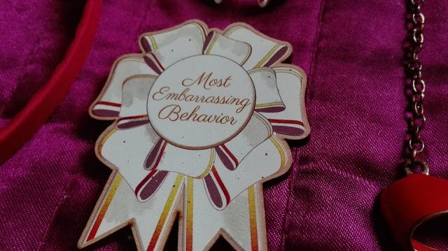
A white brooch not only stands out a bit more - this particular one is pretty iconic in our community by now. When I’m out at a meet I don’t change how I talk or act and often it comes out as ‘most embarrassing behaviour’. It doesn’t always have to be bad, as long as no-one’s getting hurt, you can just have a laugh.
 |
| Apologies for the recletion, it's not the most flattering to the ring. It is a gorgeous piece and just the right accessory. |
The rings add that extra splash of red and white, which keeps all the colours more evenly distributed throughout the outfit. Additionally, I think the bows keep the sweet in the outfit, while the polka dots on the red one add extra bit of retro.
 |
| Still gutted that Bodyline has discontinued these. Although the Cotton Candy Feet heels have a similar shape to them. |
These shoes don’t photograph well anymore, because they are a little bit battered. Still holding well despite how much they are worn. These Bodyline heels are one of my favourite pairs of shoes, they are as comfortable as they are cute.
Innocent World makes some of the best OTK socks in my opinion. This particular pair came from a lucky pack and have been a very welcome addition. The anchor theme balances the sailor themes introduced by the cardigan and I lucked out on a colourway matching my style and wardrobe so well. And that stripy detail across the ankle looks super cute with the strap on the Bodyline heels!
 |
| This lace might be my favourite lace on a dress ever. |
 |
| And a favourite of the three matryoshka cats on the print. |
 |
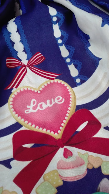
| Everything about this print is love, not just the icing on this particular cookie. |
Whipped Cream Kitty is one of my dream dresses, made all the more special by being gifted to me by my boyfriend. Every time I’ve worn it so far has been just a slight variation on this tricolour theme and retro twists. I guess this confirms how this particular dress is part of my trademark look, although part of me feels like I’m not doing that print justice by not utilising just how versatile it has the potential to be. Having said this, there is still a lot of variety you can create whilst sticking to the same colour scheme. But that’s another challenge altogether.
 |
| Every time I've worn Whipped Cream Kitty so far in chronological order. Notice the many common elements and themes. From left to right the outfits are from: May 2016, August 2016, January 2017, March 2017 and May 2018. |
Of course, a look like this is not complete without hair and makeup. A head full of 1950’s style curls, winged black liner and red lip is a classic combo in vintage fashion that works really well with this kind of lolita. Red lipstick becomes just another red accent in the coord and the soft curls match the feminine vibes to lolita fashion. While the glasses are just my regular, daily frames, I do take advantage of how well they work with tricolour coordinates and milk that cow for as long as I can.
Yes, the more I look at this coordinate, the more I feel that this is my trademark look. And as much as I said that I haven’t re-worn a coordinate yet, remembering how great I felt in this one makes me want to throw it on again.


Your coord is gorgeous!
ReplyDeleteThank you so much ^_^
DeleteThis is DEFINITELY a trademark look of yours Paulina! This challenge also seems really fun and a good way to rotate through ones wardrobe :)
ReplyDeleteThank you! If ever there was a look I felt like re-wearing, it's this one. And we could easily take these prompts to be meet themes - now that I said it, I'm actually tempted to do that lol.
DeleteAhhhhh I'm so pleased you are doing this challenge! I love the coord (and the video, so cute!) and to mean it definitely reads as typically you, especially the tricolour palette and the retro vibes.
ReplyDeleteMe too - it only took me like 15 months, but better late than never. :P And thank you. If people are saying that it reads as me, then maybe I should just embrace the look and not feel so pressured to style this JSK differently each time. ^^
Delete